Introduction
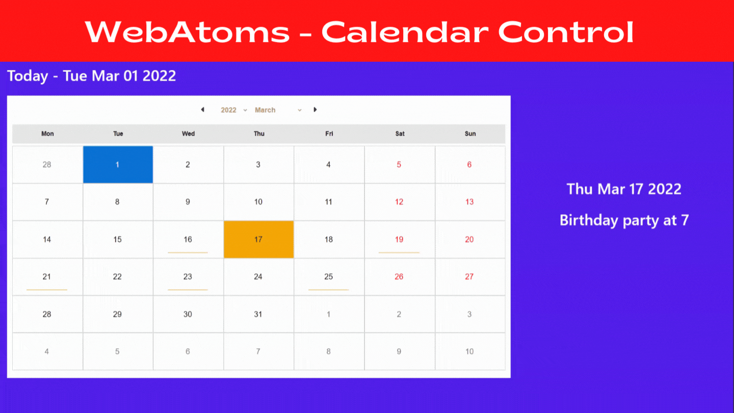
In this article, we will learn about the AtomCalendar user-interface control. It displays one month at a time, permits us to select a date, advance from month to month, facilitates the creation of the events.
What is AtomCalendar?
WebAtoms AtomCalendar control is developed on the latest modern web technologies making it fast, lightweight, easy to customize, and easy to execute. This control provides us with all the vital features to assist the users in managing their regular tasks and events with ease.
Properties of AtomCalendar
- yearStart
- yearEnd
- eventDateClicked
The yearStart property takes a number value which sets the limit of the year-selector of AtomCalendar. Years before the value set in yearStart will not be available for the selection.
For example, if the current year is 2022, and the value of yearStart = -2, then the yearStart will be set to currentYear - 2 Years = 2019. Any year preceding the year 2019 will not be available for selection.
The yearEnd property sets the upper limit of the year-selector of AtomCalendar.
For example, if the current year is 2022, and the value of yearEnd = 2, then years starting 2025 are filtered from the selector. Any year succeeding the year 2024 will not be available for selection.
The eventDateClicked property calls a method when the date on the calendar gets clicked. This property triggers changes in the UI, making the calendar control interactive.
Code snippet
<AtomCalendar
        yearStart={-2}
        yearEnd= {2}
        eventDateClicked={Bind.event((s, e) =>
                        this.viewModel.dateClicked(e.detail))}>
</AtomCalendar>
Is it Customizable?
Yes, AtomCalendar control is relatively simple to customize. It provides you with tremendous flexibility to define the presentation of your data. This control has a template feature that gives us the power to style data.
<AtomCalendar.itemTemplate>
<div eventClick = {Bind.event((x) =>
         this.viewModel.dateClicked(x.data))}
         styleBorderRadius = "0px"
         styleBorder = "1px solid lightgray"
         styleColor = {Bind.oneWay((x) => x.data.isOtherMonth  ?
         Colors.gray :  x.data.isWeekend ?
         Colors.red : Colors.black)}
      class={Bind.oneWay((x) => ({ 'date-css': 1,
           'is-other-month': x.data.isOtherMonth,
           'is-today': x.data.isToday,
           'is-weekend': x.data.isWeekend,
           'is-selected': x.localViewModel.selectedDate === x.data,
                    }))}>
</AtomCalendar.itemTemplate>
In the above code, we defined the itemTemplate and showed some inline data of control, which helps us present the data clearly and transform the look and feel of the AtomCalendar.
Benefits of using AtomCalendar
⦁ AtomCalendar allows user-defined styles, which makes it customizable according to
the theme of a website.
⦁ There is no need to install a separate npm library for using AtomCalendar.
⦁ AtomCalendar is useful in websites where the content needs to be presented chronologically, for example, events, reminders, memos, meetings, etc.
 |  |  |  |
| Like | Comment | Save | Share |
/api/attachments/att/4/linkedin-null-nan-1200-628.png/linkedin-null-nan-1200-628.100.jpg)
/api/attachments/att/249/webP.gif/webP.100.jpg)
