WebAtoms: AtomExpander - User Interface Control
What is AtomExpander?
This control is an expandable container to host any content. It contains a header and expandable content part which allows content toggling by clicking on the header.
What are the properites of AtomExpander?
- AtomExpander.detail
- AtomExpander.detailTemplate
- AtomExpander.icon
What is the difference between "AtomExpander.detail" and "AtomExpander.detailTemplate"?
In AtomExpander.detail the element already exists during the runtime whereas in AtomExpander.detailTemplate the element is created when the header text is clicked.
What is the purpose of AtomExpander.icon?
This is a bindable property which can be used to add an icon to the header text. For e.g. you can integrate it with FontAwesome icons.
WebAtoms now provides AtomExpander as the control for Xamarin.Forms. Let us learn the how to use the control through an example.
AtomExpander Code Sample
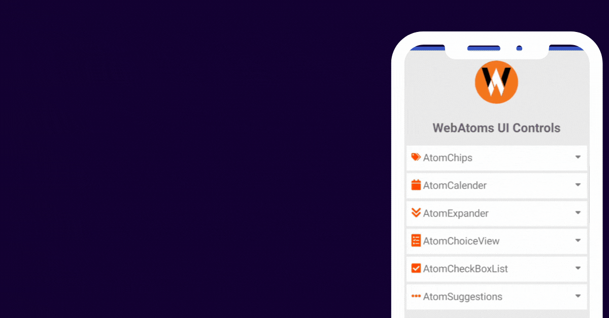
The demo example displays various controls WebAtoms offers and explains how to use the AtomExpander control and its important properties. In this example we are explaining what controls does WebAtoms offer and one liner description of each of the controls. The sample also explain how to integrate the Font Awesome icon with the header (or the expandable) text.
Let's learn how to design the content page / layout for AtomExpander.
Content Page Design
<WA.AtomExpander
    padding={5}
    backgroundColor={XF.Color.white}
    horizontalOptions="FillAndExpand"
    >
    <WA.AtomExpander.icon>
        <XF.FontImageSource
            fontFamily={FontAwesomeSolid}
            glyph={FontAwesomeSolid.tags}
            color={XF.Color.orangeRed}
        />
    </WA.AtomExpander.icon>
    <XF.Label
    fontSize="20"
    text="AtomChips"
    />
    <WA.AtomExpander.detail>
        <XF.Label
            text="This control is a material design dynamic element
            which can be used as input, or to select and filter
            content or to trigger an action."
        />
    </WA.AtomExpander.detail>
</WA.AtomExpander>
For the complete sample, you may refer the demo link.
We do not need a ViewModel for this example. But we might need a ViewModel for some other requirement. For e.g. after the control is expanded you want to show certain items and when the control is collapsed you want to hide certain set of items.
XF-Controls version being used is 2.0.47.
 |  |  |  |
| Like | Comment | Save | Share |
/api/attachments/att/4/linkedin-null-nan-1200-628.png/linkedin-null-nan-1200-628.100.jpg)
/api/attachments/att/249/webP.gif/webP.100.jpg)
