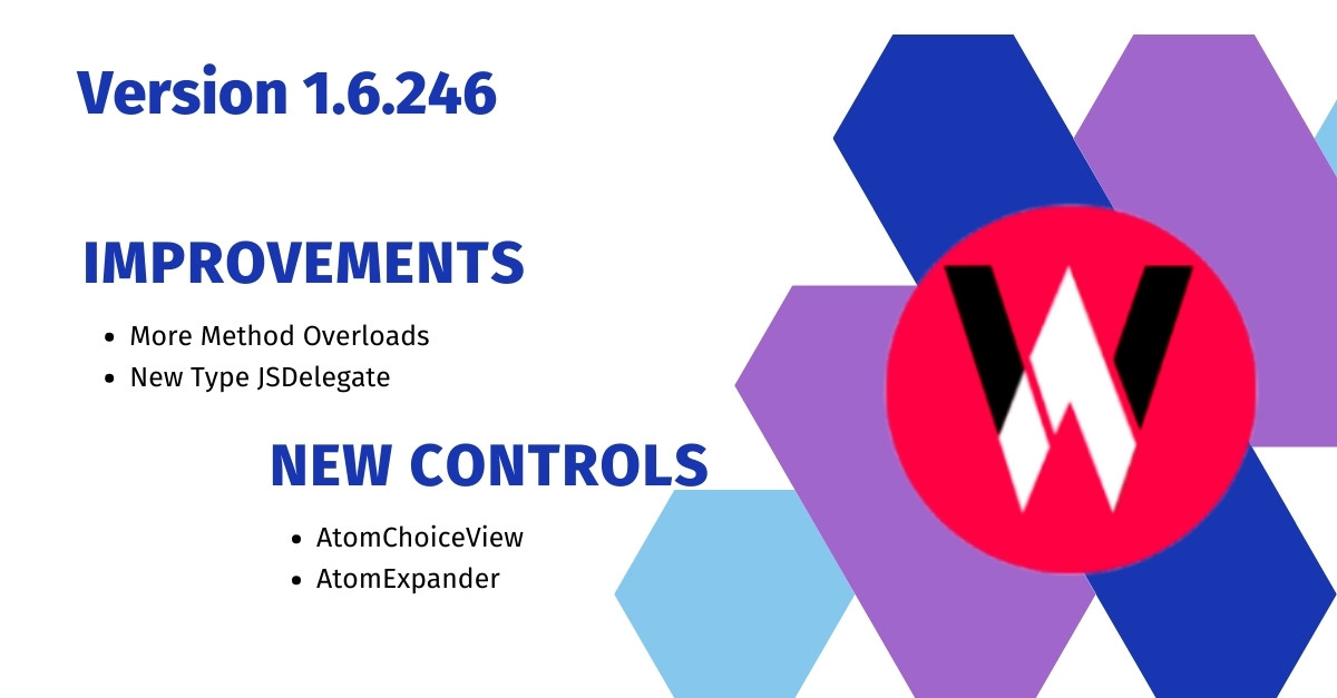
We are happy to announce following new features in this release Version 1.6.245.
Method Overloads Added
Method overloads for InvokeFunction, CreateNewInstance and InvokeMethod in IJSValue are added to reduce array allocation. There is no change in exiting APIs, they will continue to work as it is. C# compiler will automatically choose the method with same parameters instead of creating an array. However, internal implementation will allocate an array for parameter, but we have managed to reduce the array allocation by 50%.
New Type JSDelegate
We have added new Type JSDelegate which creates a typed delegate for JavaScript function. So you can easily assign JavaScript function as delegates. Example explained in next section.
TextToModel Delegate in AtomChips
We have added TextToModel property of type Func<string, object> which will be used by the control to convert entered text into any object model. If it is null, entered text will be added to SelectedItems array.
   <WA.AtomChips
           selectedItems={Bind.oneWay(() => this.viewModel.selectedItems)}
           textToModel={(text) => ({ label: text, value: 0 })}>
           ...
In example above, entered text will be set as label, and object literal will be added to selectedItems.
New Control - AtomExpander
We have added new AtomExpander control, which has following properties.
- IsExpanded - This is controlled by the drop down arrow, however, you can also bind it and update it from the code. If it is true, the details will be visible.
- Icon - ImageSource of an Image that will be be displayed on the left corner.
- Detail - You can set any
Viewas child ofDetailproperty, it will be hidden and it will be visible only whenIsExpandedis set true. - DetailTemplate - Instead setting detail, you can set this property as
XF.DataTemplateand a new detail will only be created if control is in expanded state. As soon as control is collapsed, detail View will be destroyed.
New Control - AtomChoiceView
We have added new AtomChoiceView control, which is same as AtomXFComboBox but it is written in C#. It has following properties.
- ItemsSource - list of items to be displayed in popup, choices will be displayed even if it is empty.
- SearchEnabled - a text editor will be displayed as soon as the control is tapped, you can use
Searchproperty to filter your items source. - DropDownHeight - height of the popup, default is 200
- Prompt - a selection message displayed if
SelectedItemis null - EmptyItemTemplate - Prompt that will be displayed if
SelectedItemis null ,Promptwill be ignored and this template will be displayed as Prompt. - ItemTemplate - item template for the choices and selected item.
- SelectionStartCommand - it will be executed when the choice popup was opened.
- SelectionEndCommand - it will be executed when the choice popup was cancelled or closed.
- Search - the text that is entered in search box if
SearchEnabledwas set to true, you can use this to filter your items source.
 |  |  |  |
| Like | Comment | Save | Share |
/api/attachments/att/4/linkedin-null-nan-1200-628.png/linkedin-null-nan-1200-628.100.jpg)
/api/attachments/att/249/webP.gif/webP.100.jpg)
