WebAtoms Expander
This article explains Expander control in detail and highlights a way to implement this control which is present in the WebAtoms framework. The Expander is the user interface control imported from the WebAtoms library.
What is Expander control?
WebAtoms Expander is the functional component. For implementing the Expander control, there is no need to extend it into our class component. It helps in easy implementation of the layout, which is needed to expand and collapse, which can help add multiple interacting options on a single screen.
Properties of Expander control
icon- icon is a string property used in assigning the icon code or path name. It is an optional property utilized for enhancing the layout by displaying icons.isExpanded- isExpanded is a boolean property that expands the form layout when set to true and collapses when set to false. By toggling theisExpandedproperty, we can expand or collapse the view on some DOM event.
How to implement the Expander control?
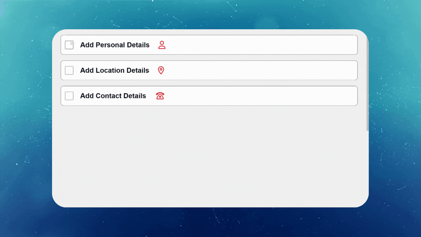
In this example, we will use the Expander control to display a form in separate sections where each section is a separate Expander, shown separately in the ExpanderDemoScreen.
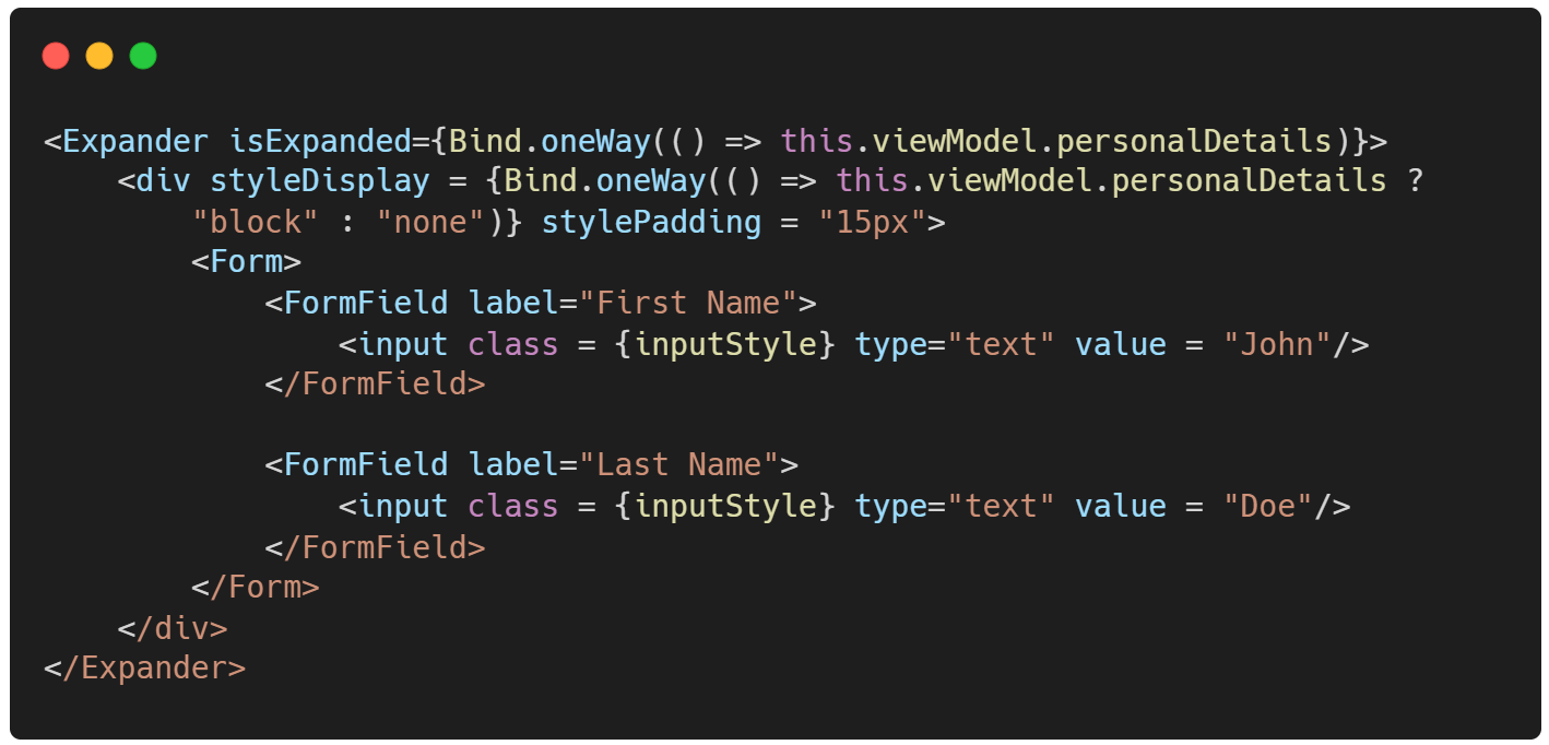
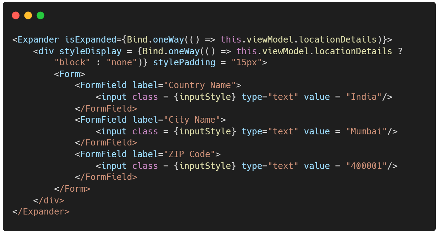
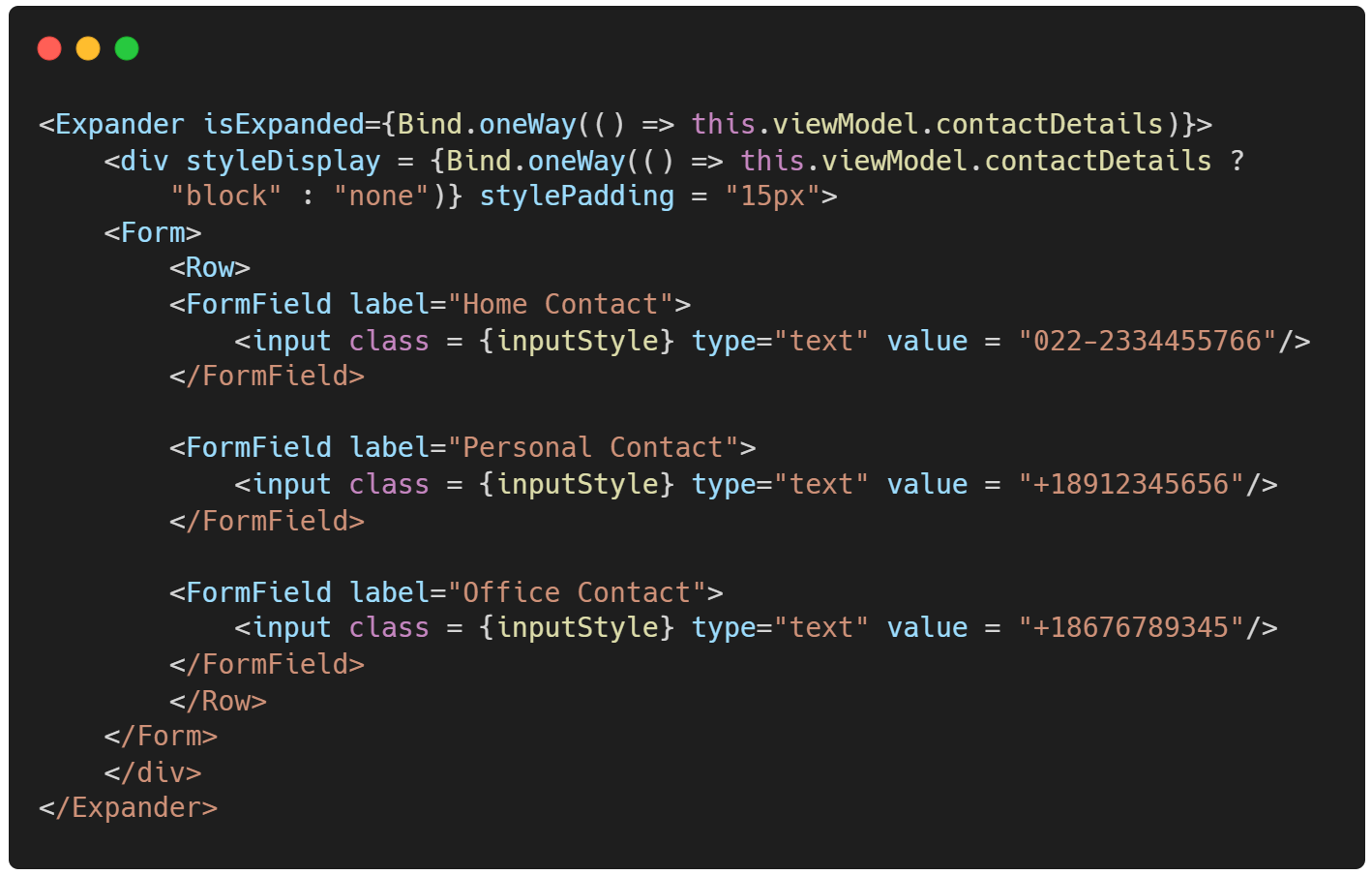
Code for ExpanderDemoScreen
In this example, we will create three simple forms inside an Expander where each Form in the Expander has unique user fields. The layout of the screen only allow one Form to display at a time.
When one Form is in an expanded state, the other two remain collapsed.
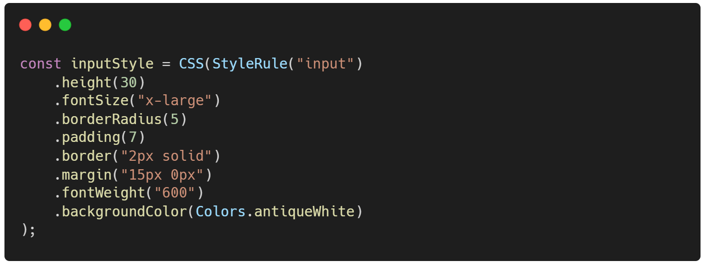
Code snippet for css of ExpanderDemoScreen
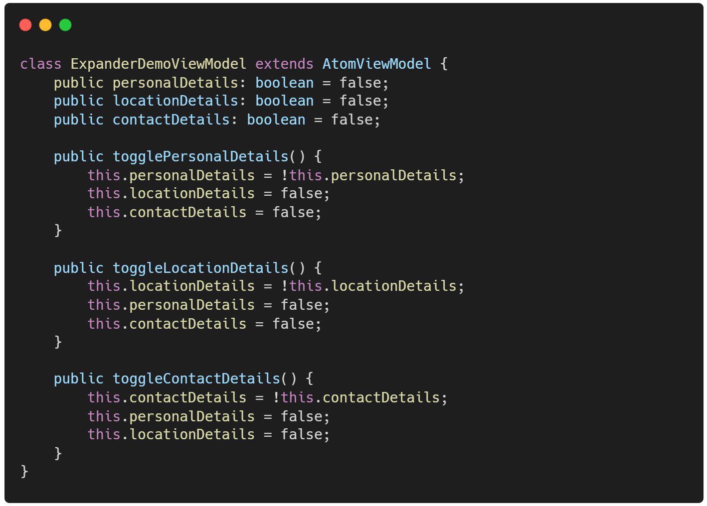
Code snippet for ExpanderDemoViewModel
The logic for implementing desired expand and collapse behavior.
Advantages of Expander
Expandercontrol helps create layouts having a master-detail flow. Mainly beneficial when there is a requirement for implementing single-page applications.We can generate dynamic layouts, as
Expandergives us control over the view displayed when a particular event has occurred.An
Expandercontrol is beneficial when there is a requirement of showing only a part of a large layout at a time, making it efficient in small screen sizes.The
Expandercontrol is a lightweight and responsive control.'Expander' can be expanded or collapsed without defining any event.
As 'Expander' is a functional component hence it is reusable and gets initialized in the constructor of the class component.
 |  |  |  |
| Like | Comment | Save | Share |
/api/attachments/att/4/linkedin-null-nan-1200-628.png/linkedin-null-nan-1200-628.100.jpg)
/api/attachments/att/249/webP.gif/webP.100.jpg)
