This article will cover the file upload control in WebAtoms. Today we are heading to understand how to build or implement a file uploader.
Why HTML File Upload?
To understand the WebAtoms FileUploader, first, we need to go back to check how to upload the file in simple HTML and JavaScript.
We have to add the input tag with a file type, and on the onChange event we can obtain the uploaded files data. This HTML input allows us to open the file explorer and upload the files to our systems or applications.
Why WebAtoms FileUploader control?
The above HTML file uploader is not easy to style. Even we cannot change the content of the button. HTML File uploader is the default file uploader that doesn't look attractive. We don't see this uploader in modern web applications.
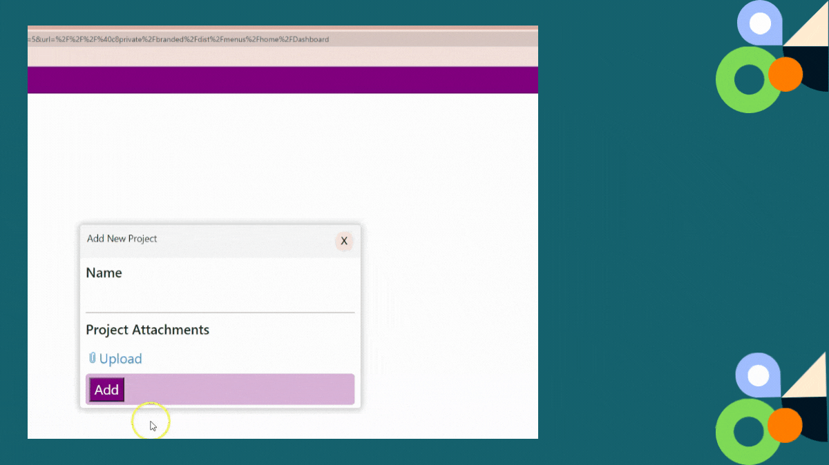
On another side, WebAtoms has introduced the FileUploader user interface control. FileUploader is a class component that extends from AtomControl. This control solves the stylistic issues and adds new attributes and methods to help you develop a better user interface experience for file upload.
What are the properties of FileUploader control?
multiple - Allow the user to select multiple files from file explorer.
uploadLabel - Allow the user to change the label of upload control.
fileFilter - Allow the user to filter the type of file to upload.
isDisabled - Allow the user to disable the upload.
fileFilterMessage - Allow the user to show the custom message based on the file filter attributes.
What are the events of FileUploader control?
eventUploadFinish - Event fired when file upload is complete.
eventUploadClick - Event fired when the page is loaded.
eventUploadSelect - Event fired when a file has been selected for an upload operation.
eventUploadStart - Event fired when uploading of file has started.
Code Snippet?
 <FileUploader
                uploadLabel="Upload Button"
                eventUploadFinish={Bind.event((s, e) =>
 this.addFiles(e.detail))}
            />
In the above code snippet, We have shown how to implement the FileUploader control.
The uploadLabel property enables us to caption the control as per user requirement.
The eventUploadFinish event occurs when the file is uploaded successfully. It will call the addFiles method with the file details as parameters. After that, we can send the file to a backend via an HTTP POST call.
How to upload the Multiple Files?
 <FileUploader
                uploadLabel="Upload Button"
                multiple={true}
                eventUploadFinish={Bind.event((s, e)
                => this.addFiles(e.detail))}
            />
By default, the browser file selection dialog will allow the user to select only one file for upload.
Adding property multiple and making it true, enables us to upload the multiple files.
Advantages of WebAtoms FileUploader control?
The very first benefit of using WebAtoms FileUploader helps us to rename the content of the upload Button using the
uploadLabelproperty.This control has the inbuild progress bar attached to it, which is visible only while the upload file is still in progress.
The Cancel button is visible both during the upload process and after the file upload process is complete.
This control provides many properties which enhance the user experience. In some scenarios, we need to disable the upload, for that we need to simply set the isDisabled property to true.
The other significant advantage of using this WebAtoms
FileUploadercontrol is to restrict the user to upload a file of a certain type. For instance, in some scenarios, we need to upload only the image file, we can achieve this by using thefileFilterproperties.We can also send warning message to the end-user using
FileFilterMessageproperty of this control.According to the requirements, we can transform the style of this control. This control is built using modern web technologies using JavaScript and HTML. This control is very lightweight in nature and very straightforward to implement.
 |  |  |  |
| Like | Comment | Save | Share |
/api/attachments/att/4/linkedin-null-nan-1200-628.png/linkedin-null-nan-1200-628.100.jpg)
/api/attachments/att/249/webP.gif/webP.100.jpg)
